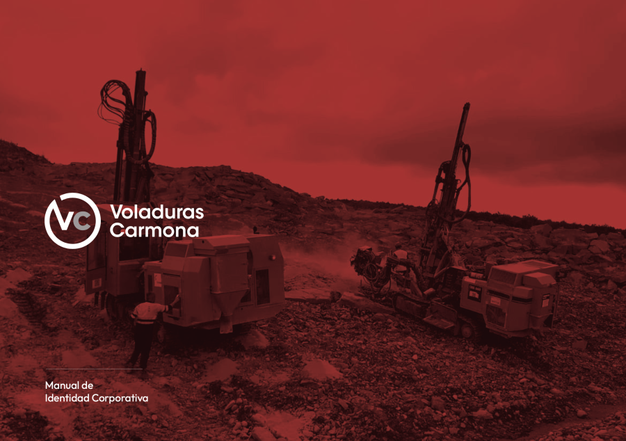
It was time to modernize the image of the company, and we have achieved it!
We have created a new logo, returning to our original colors, red, gray and black...strengh and mining, that represent our blasting and mining services activity.
At the typographical level, we have chosen rounder and stickier fonts, always a symbol of modernity, but clearly legible on any device and in practically all sizes.
We hope you like as much as we do.
Latest News
-
07/05/2026
Precision engineering at the Olerón Wind Farm (A Coruña). An exclusive service provided by Carmona. -
19/03/2026
We are taking part in the conference “From Galicia to Europe”, organized by COMG and AMINER -
23/02/2026
Project: trench excavation for pipes, 3 metres from a gas pipe. Work in Arteixo (A Coruña) -
22/01/2026
Recognised leadership: Voladuras Carmona closes a brilliant year with a feature in the leading magazine ‘Rocas y Minerales’ -
01/12/2025
We attended the conference ‘Mineral resources and the energy sector’ organised by Cluergal, Xunta de Galicia in Vigo.
